Walmart Unveils Modern Logo Redesign
Walmart has unveiled its first brand refresh in nearly two decades, introducing a modernized logo and updated visual identity to align with its digital transformation and honor its heritage.
The update reflects the company’s ongoing digital transformation and aims to bring a modern yet nostalgic feel to its brand, maintaining a connection to its founder Sam Walton’s legacy while ushering in a fresh look for the future.
Walmart’s Logo Redesign: Key Features and Highlights
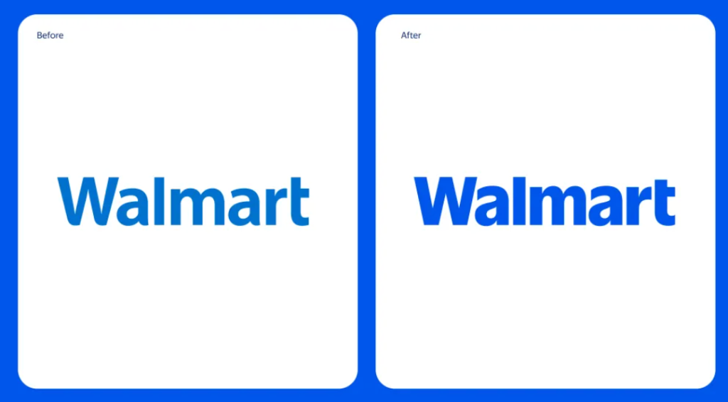
1. A Modern Wordmark with a Nod to Heritage


The most noticeable change in Walmart’s logo redesign is the updated wordmark, which now draws inspiration from Sam Walton’s iconic trucker hat. Walmart’s new, custom font is designed to be more distinctive.
2.The Spark Symbol Shines Brighter Than Ever
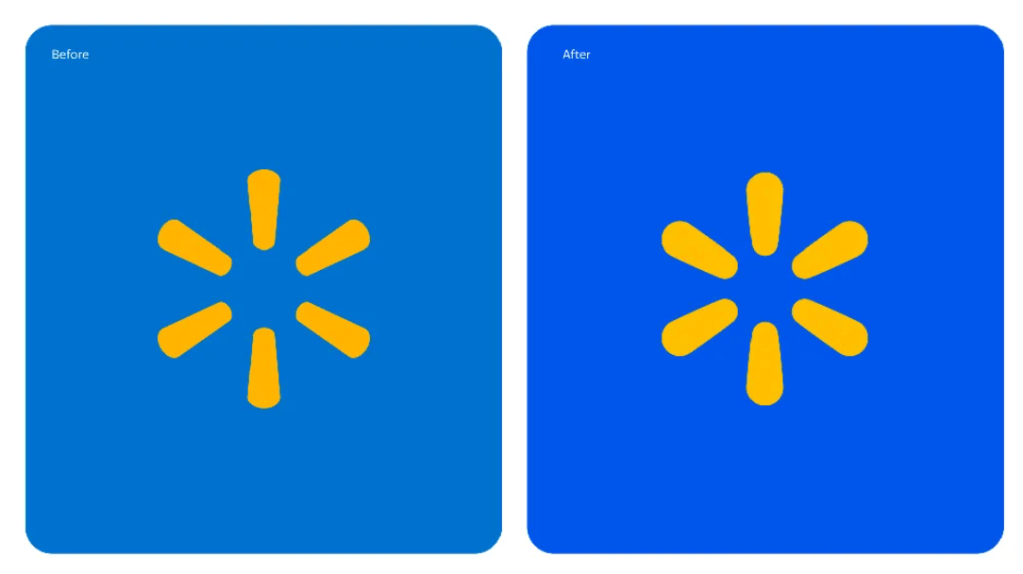
A key element of Walmart’s new branding is the iconic “spark” symbol. It’s now brighter and bolder. Since its introduction, the spark has represented the energy and spirit of Walmart, guiding customers through their shopping experience.
3. True Blue and Spark Yellow: The Heritage Color Palette
Walmart’s new color palette, featuring True Blue and Spark Yellow, plays a crucial role in the brand refresh. The True Blue color stays true to Walmart’s heritage, while Spark Yellow adds a fresh, modern twist..
4. Approachable and Relatable Tone

As part of the redesign, Walmart has emphasized a more relatable and approachable tone throughout its branding. This tone is conveyed through the use of friendly, inclusive language and visuals, making Walmart feel accessible to its millions of customers.
- Urban One Radiothon For St. Jude Kids Raises $1.6 Million
- US Embassy Official Told Trump’s South African Refugee Program Is For White People Only, New Report Says
- The 50 Hottest, Flyest & Sexiest Looks from Beyoncé’s ‘Cowboy Carter’ Tour
- Rest In Power: Notable Black Folks Who We’ve Lost In 2025
- Celebs Who Turn 50 This Year
Walmart Unveils Modern Logo Redesign was originally published on b1057.com